I led a rebrand for APCA, a non-profit committed to inclusivity across a vibrant, multicultural population. The refreshed identity pivots from a culturally narrow viewpoint to celebrate the full tapestry of nationalities APCA represents. The new look features a bold, compact logo with lively, nature-inspired hues—channeling the beauty of botanical diversity. A crisp, leaf-green tone anchors the brand, signaling openness, friendliness, and a welcoming modern energy
APCA continues its vital work empowering community members with translation services, educational events on navigating government systems, healthcare enrollment support, immunization drives, and family-focused programs. This visually inviting and accessible identity now reflects both APCA’s values and the community’s rich diversity.
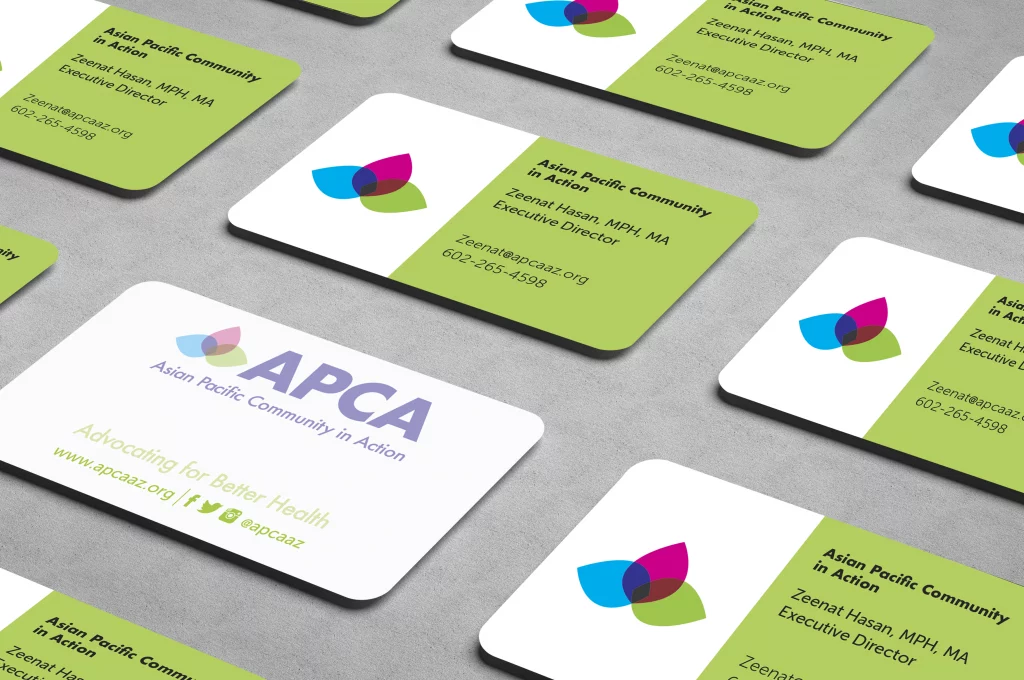
Business Cards
Rounded corners, matte finish. The backside of the cards was screened for the staff to write informationon.
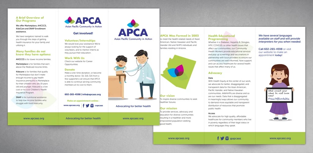
Trifold Brochure
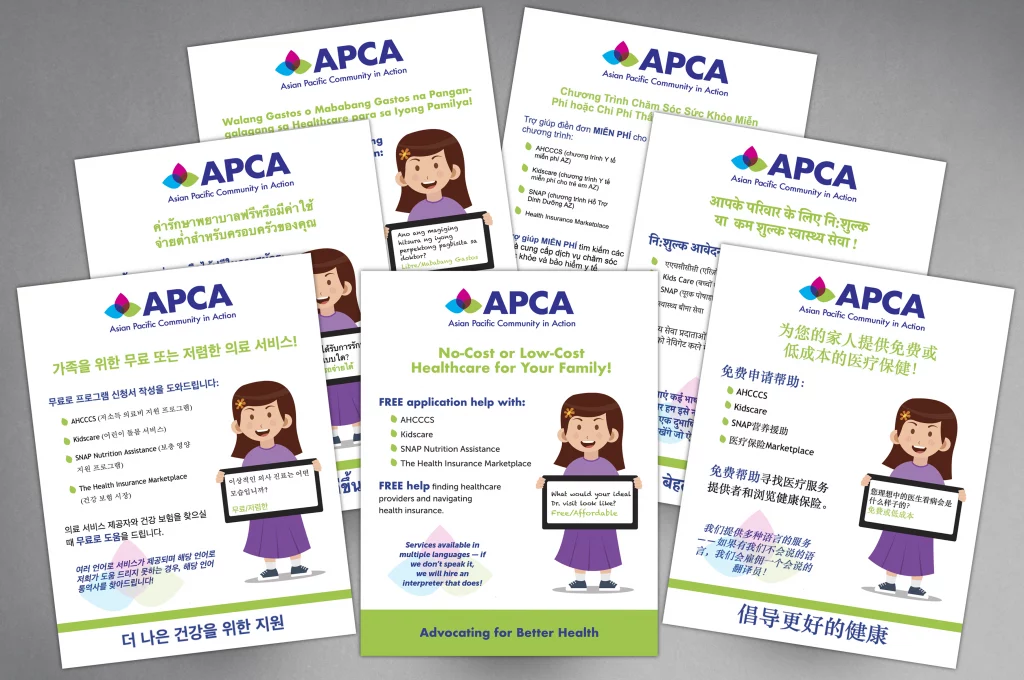
Flyers
Produced in multiple languages: Chinese, Korean, Thai, Tagalog, Vietnamese, and Hindi.
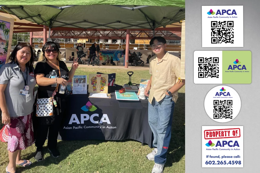
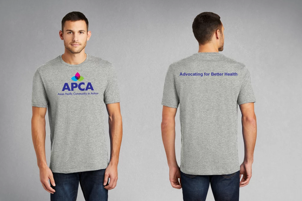
T-shirts
Tablecloth and Miscellaneous Stickers